Your Intranet Is More Than Just a List of Links
Does your intranet consist of a huge list of links? Are all your users focused on the number of clicks it takes for them to find their way to some tool they use? These are signs that you might have a problem with how your intranet is perceived and/or designed.
I hope through the following will help you understand why links are not the most important part of your intranet and how you can help users get value beyond links.
Intro
Links are an important part of any intranet – you create a reliable and discoverable resource for employees. However, end users and content creators often take the importance of links too seriously. If you find yourself in a debate regarding how many clicks it takes for someone to get to a link to a tool or end up with who pages dedicated to a list of links, you should reconsider the priority you are giving to links.
Links are Important
Too often site owners tend to underestimate how proficient their staff are at navigating and adapting to a new site, especially when it’s strategically designed with them in mind. If content was migrated from a site that already existed, users usually have an idea of the document title to search for or section of the site to look in when they’re browsing for information. And it's the site owner’s job to create a site where the important content is visible, accessible, and up to date.
Many site owners struggle with keeping their intranet sites up to date. When things like document names or links change, they need to remember and fix those changes. This is true even if the content is just moved to a different place on the same site. The newer SharePoint experience tries to make this easier by using dynamic links, but it's important to set up your content in a way that makes updating pages as simple as possible.
Some people choose to put lots of links in lists on a site, while others might insert links within paragraphs of text on a page. While those methods can be useful in some situations, the most effective way to handle links is by adding and organizing them right on the site page using the Quick Links web part. It's simple to set up, and it keeps your links where you can easily find and manage them.

Context Is More Important
There are better ways for employees to store links they use all the time:
Users are probably more familiar with where content they use often is than you realize. As a site owner, you need to balance hosting content in a prioritized way for new users, frequently accessed areas, and recently updated data. When the site is designed for these purposes, users end up getting the hang of things quickly, especially if it’s standardized across your sites.
Adding context and extra detail is what an intranet is built for:
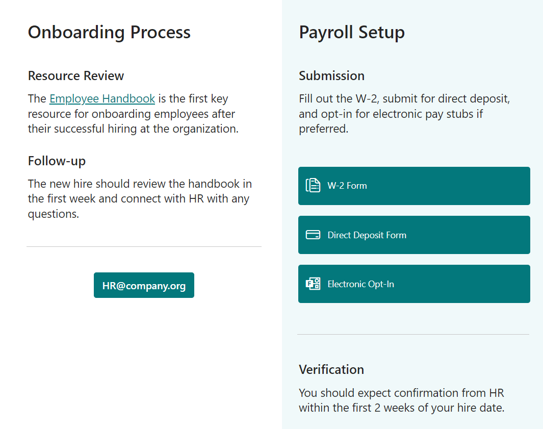
Of course, you can make links and sections more informative by adding details about the steps to follow or specific points in a process. When your intranet surrounds these links with extra information, it reduces the chances of people having questions or needing explanations from those involved in that process.
Understanding your audience and giving them a clear path to what they need is really important. When you accurately figure out how users are using the content and refine the additional information they need about certain files and links based on their feedback, you can directly connect with your users and make the content clearer.
While embedded hyperlinks and button web parts can do the job, I'm finding the Call To Action web part more and more helpful. It can strike a great balance – making a specific part of the page stand out while offering a dynamic link with some guidance. It truly encourages the user to take a specific action without hiding the process or burying the important details within a long block of text.

Some General Rules
Your landing page shouldn’t have links that don’t change regularly:
Some users may be required to visit your site to access content, but that doesn’t mean enticing your users to visit isn’t a worthwhile endeavor. Managing the “lifeblood” of your site content is just as important as keeping the integrity of the data up to date. Introducing news posts, rolling up last modified files, and showcasing registration for upcoming events are just some examples of dynamic content that engages your users and reminds them that this is a tool to visit frequently. If nothing ever changes on the homepage, then they’ll remember that before considering taking a look the next time.
Your navigation shouldn’t have links directly to tools:
Tools and Apps at your organization are much more special than clicking off to another site page or opening a PDF. Accessing company tools or starting a business process usually moves the user out of the site (or potentially even the M365 space) and you want to keep from jarring you audience if they see it buried within the site navigation and anticipate a simple page refresh. Components like those are better surfaced either in callouts directly on a site page where they come into play, or perhaps even in a higher level like the customized part of the SharePoint app/waffle bar.
Use sections and title text to make you able to deep link:
While a common worst-practice is to bury hyperlinks within walls of text, that’s not to say that you can’t strike a balance including it in a process outline or list of resources. The key is to utilize the whitespace and font styling to format a content pacing that users can follow easily. Breaking out page sections and text boxes with theme colors and header sizes help display the critical components to the audience in an orderly manner


Is Team Communication Holding You Back?
Find Out in Just 2 Minutes.
Take our quick scorecard to uncover communication gaps and hidden barriers within your team.
Modern Layouts and Link Web Parts
Now let's talk about how your content looks. The classic quick links list can be overwhelming and really unexciting. A long list of terms repeated in the same way can make users lose interest. It also gives the impression that you don't think the content is worth presenting nicely, so why should they bother reading it?
Instead of just using quick links, think of your whole site page as a canvas for these links. Imagine a user starting at the top of the page and going on a journey through your content. They might see a welcoming message for new visitors, then notice buttons or calls to action between paragraphs. You can still put links within text, but using Hero tiles and default link web parts lets you automatically include images related to that content just by pasting the URL. Here are some basic elements that work for most of my site creations:
- Text Box
- Button or Call to Action
- Hero or Highlighted web part
In the older SharePoint, updating pages was clunky and slow, so people focused on keeping content visible even if it meant more maintenance. With the modern site page in SharePoint, things are much easier to update. It takes about the same time and effort to edit 10 buttons on a modern site page as it did to manage those links in a backend list and then see the updates on the page later.
As site owners spend more time using modern SharePoint, they start to feel more comfortable letting go of some link lists and custom HTML formatting. They also realize how important it is to have some empty space on the page and get better at arranging their content across the page in a more engaging way for users.
The Megamenu should accommodate users anywhere, but you can still have landing pages
Every site collection has a default homepage that you should treat as a landing page to the rest of the content within that site. Some essentials we see most frequently:
- Rollup of highlighted pages, events, and news.
- Frequently accessed files and links.
- Featured content across the site navigation.
- Department owners and contact info.
Sometimes a department within an organization has an entire site collection reserved for itself, and sometimes it may only be one page within a greater resources site. No matter what, how the page looks is less important than deciding what content to put on the pages and in what order.
Once you have multiple sites associated to your intranet, your navigation should start coming into focus. You might highlight each site as a main heading in the navigation bar or use labels to group pages or files from different sites in the hub. This is a good chance to list everything within each area in a clear and organized way for your users.
Use Additional Components
Finally, when creating content in modern SharePoint, it's important to embrace the new simple and clean look of the site. The rush to finish projects often leads us to include too much content just for the sake of it. Here are a few last tips that should save you time and help you feel more at ease:
- Make use of what Microsoft already offers. Check out the SharePoint App/Waffle bar and decide on your site footers early to avoid redundancy.
- Dynamic news is temporary and expires, let it fall away and live in the background.
- Teach your users the right way to find content whether it’s on a page, in navigation, or search.
- Above all else, avoid clutter. Microsoft automates the whitespace and it's correct – DON’T CLUTTER.
Conclusion
The key to decluttering and maintaining your site is to intentionally give your content and pages an organized home. Rank what is most important/frequently used and place it in a way that is consumable for those accessing it. Standardize organization across your site collections and, once in place, do your best to have users navigate it the way you intended, and adjust when needed.
Additional Resources
How to find your SharePoint pages and news posts
Plan and implement SharePoint site navigation


.webp)


