Get To Know the New Modern Controls in Canvas Apps
Today I’m going to provide a quick review of the new modern controls in Canvas Apps. These new controls are in preview, but you should get to know them now.
When fully available, they’ll make your canvas apps faster and the user experience better and more intuitive. And even though they’re still just preview right now, there are a few of them that will save you time today.
Fluent Design
The first thing that we should call out is that the new modern controls for Canvas Apps are based on Microsoft’s Fluent Design System. This is a pretty big deal, and it is just plain cool too, IMO. The Fluent Design System or Fluent UI is not so new, it has actually been around for several years now. It is an open-source system of standard controls, components, and design principles. The Fluent Design System is being used all over the world, across many different platforms, domains, and applications. Fluent UI provides support and toolkits for React, Android, macOS, iOS, Web, Windows, etc. and even provides cross-platform support. This system is also being implemented across all Microsoft products. This is already used in the web versions, or latest desktop versions, for many apps in Office and Office 365 suite such as Word, Outlook, Excel, Teams, SharePoint to name a few.
So, what does this mean for developers and users of Canvas Apps?
I think the first thing I think about is that the apps I build with these controls will readily match the “office tool UI”. This is nice because it means less hoops to jump through to make things look pretty, but it also meets a “standard” set by other commonly used apps, which ultimately makes it easier for users to understand user interface patterns, and therefore your apps.
Something else to consider is what this might mean for cross-platform support from a Canvas App. This simply increases who can use our Canvas Apps effectively by expanding native support for more devices. Think of organizations with a variety of mobile device types or tablets in service, or even BYOD scenarios.
In addition to these advantages, the Fluent Design System will provide better performance, is designed with accessibility in mind, and is also much simpler to use, as I will demonstrate in this article.
What Does This Mean for My Canvas Apps?
One thing to take note of is that this new capability comes on the heels of this same Fluent UI being introduced as a feature that can be enabled for Model Driven Apps. So, if you are enabling that feature, you will want to consider the impact / need to do the same for any Canvas Apps / Custom Pages that you are embedding in your Model Driven Apps.
For a side-by-side comparison of modern controls with the old Canvas Apps controls, I will refer you to this article... Modern controls coming to canvas apps | Microsoft Power Apps. It is a quick read and does an excellent job of demonstrating the visual differences as well as instructions on how to enable this for your app.
I will also highlight a couple of differences that I found interesting. I set up some quick examples and quickly noticed that the configuration experience is a little bit different. First, if you are using the new modern dropdown or radio group controls, when you bind these to some data, maybe a collection, you’ll notice that this configuration behaves differently from what you might be used to. You can select your collection, but then you’re given an option to bind specific fields, and this experience, at least for now, is using a similar pattern to when you are adding / binding fields to a data form.
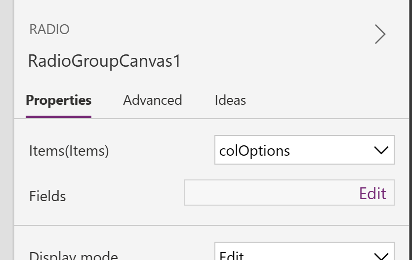
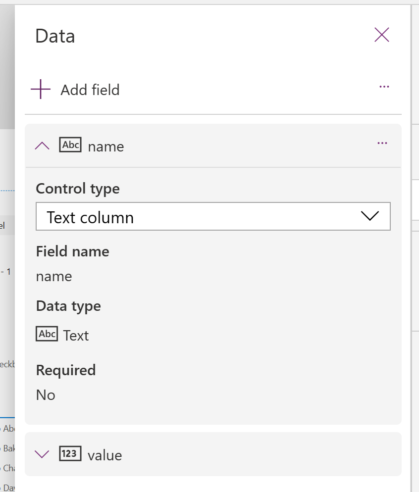
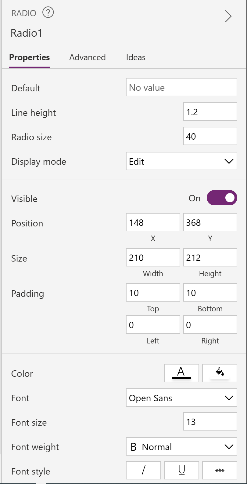
The next thing you’ll notice pretty quickly is the sheer simplicity of configuration for these controls. Or maybe it’s just that there are a limited set of properties, and this will change in the future. When looking at these controls side-by-side with their previous counterparts, you’ll be left wondering if you’ll be able to customize them as much as you are used to doing, or maybe it will not matter because Fluent UI is that much better?
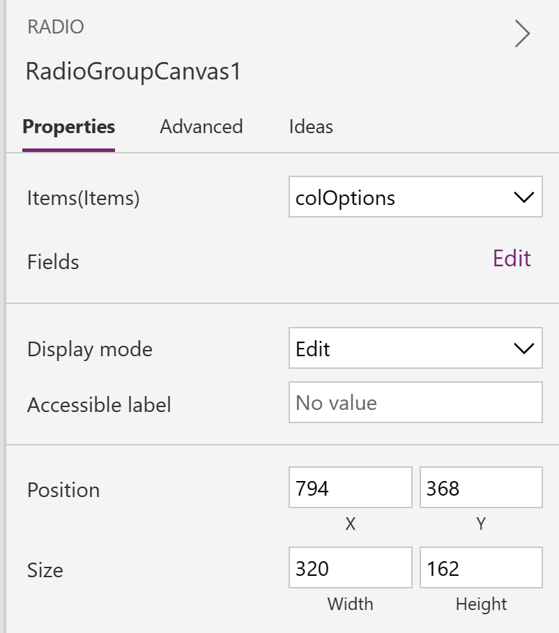
Settings like padding, font size, color, border and others are simply not available for the modern controls, even in the Advanced properties tab.
How About a Few Big Wins!
This brings me to the real wins I see with the modern controls in this early release. There are several controls that are now available that we would previously have to hack various controls and components together to mimic behavior that we wanted. I can’t tell you how many hours I’ve spent cobbling things together to mimic form tabs, progress bars, or loading spinners.
Let’s take a look at a few of these.
SELF ASSESSMENT
Is your business getting full value from your M365 subscription?
Billions of dollars are wasted each year on underused subscriptions. Take 3 minutes to find out where your tools are driving results, and where they’re holding you back.
Find Out Now

Is Team Communication Holding You Back?
Find Out in Just 2 Minutes.
Take our quick scorecard to uncover communication gaps and hidden barriers within your team.
Modern Tab List
When working up a sample app for this article, I found the modern Tab List control to be extremely useful for switching visibility on the sample controls that I configured. We’ll start with that.
Once you add a Tab List to your screen, you can easily configure the tabs by binding the control to some data. In my example I created a simple collection and selected it in the Items property of the Tab List control, then chose the fields I wanted to include.

Once configured, you can toggle visibility easily by setting the Visible property on your containers or controls to TabList.Selected.name = “Tab Baker”.

So quick and easy! I am going to use this a lot.
Modern Link
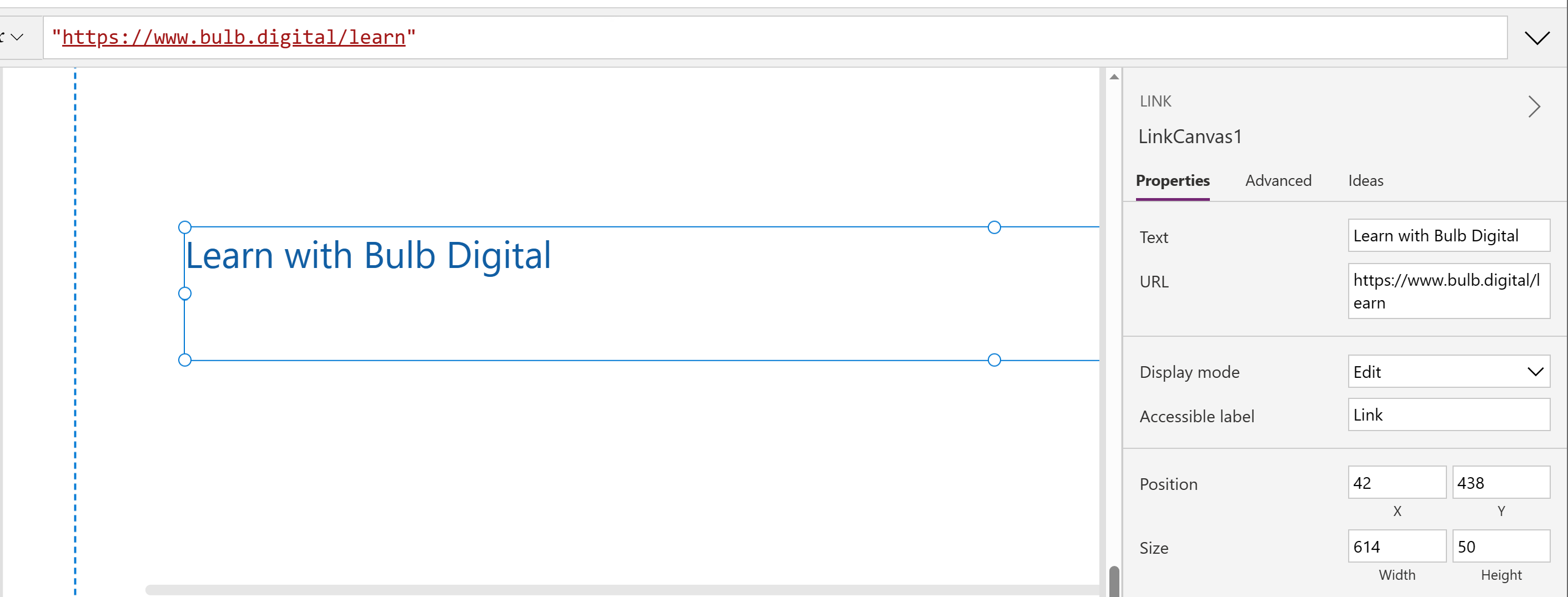
The next one to look at is the Link control. If you’ve spent any time building Canvas Apps at all, there were a few methods you could use to provide a link to somewhere else. The most common was to use a Rich Text Control and stick a link in it. No doubt this is easy to do, but it seems a bit mis-aligned with the purpose of Rich Text controls.
Good news, we don’t have to feel icky about that anymore. Enter the modern Link control. Drop it on your screen, set the Text and the URL properties and call it a day.
Modern Spinner
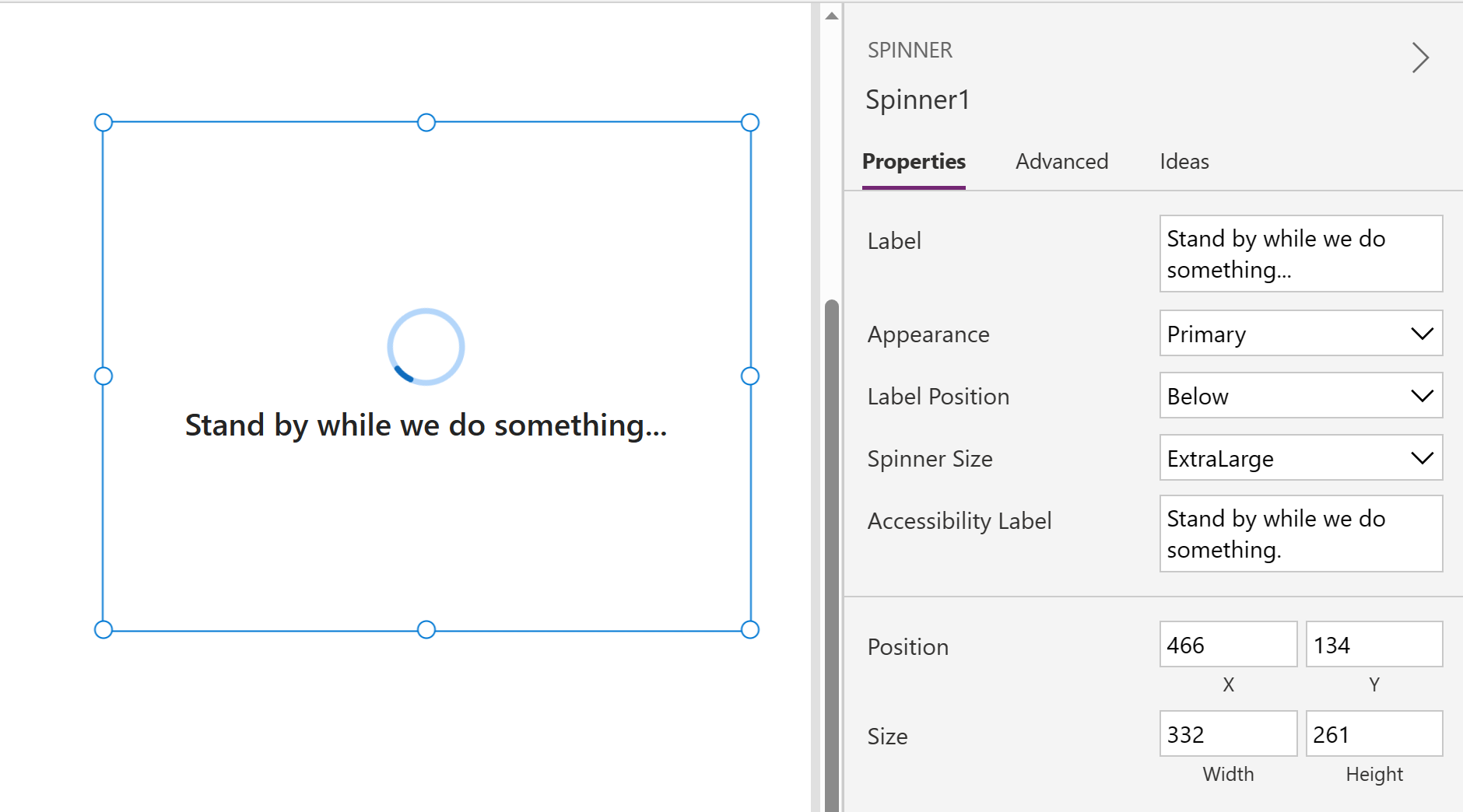
Now, let’s look at the modern Spinner. The loading spinner is a common method used to let the user know that something is happening, and they should hold tight. This gets used all the time when data is getting loaded in the background, in the OnStart, or in the OnVisible events. We used to piece this together with an animated gif image, added to the app’s media, a label to accompany it with a message to the user.
Now, all the pieces you need are baked into a single, easy to use, control. Drop it on your canvas, set label text, position, size. Then set visibility as you normally would, only in one spot.
Modern Progress Bar
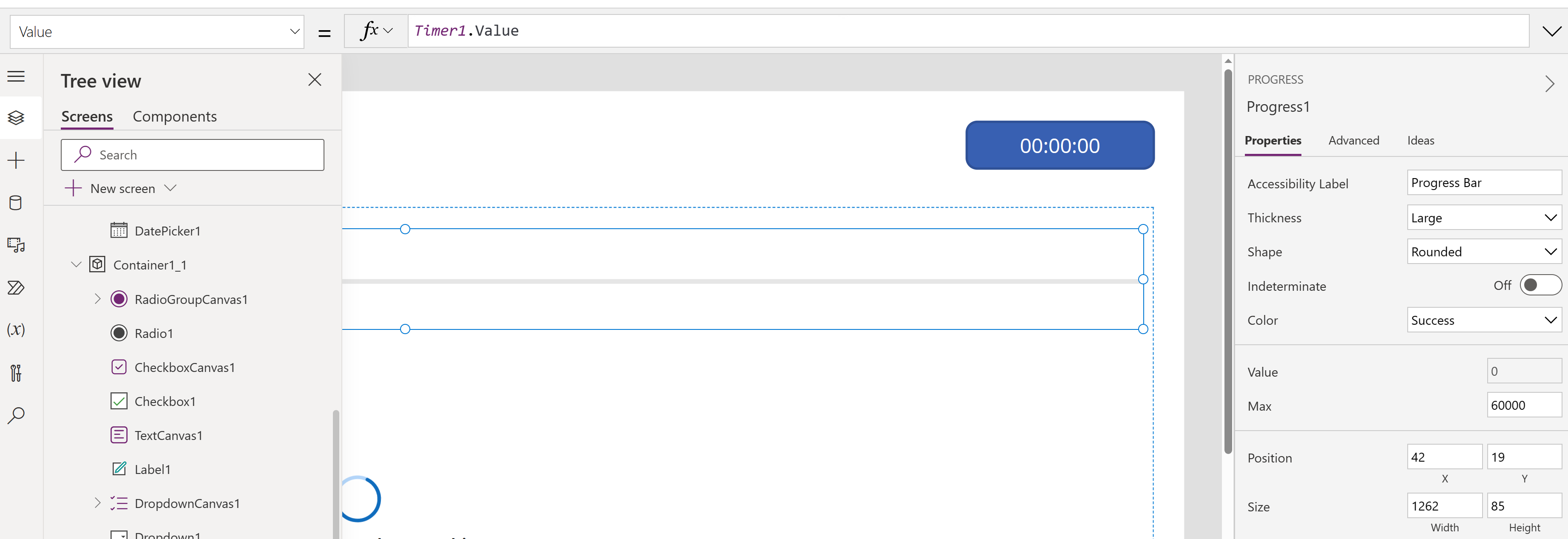
Almost there... check your progress with the modern Progress Bar. I know I’ve simulated progress bars before with various shape controls, dynamically setting length and color based on whatever my status values were. Just like the other scenarios discussed, it’s all just a bit hacked together.
The new Progress Bar control, like the others, makes this a simple thing to do. Simple configuration of what the maximum value is, the current value (based on your “quantified” status), and some visual options, simplify communicating progress to your users.
Modern Info Button
Last, but not least is the modern Info Button. I really like the potential of this control as I have implemented similar functionality before, on data capture forms, using Icons placed inside datacards, then using the OnSelect on the icon to show and hide a container with a text label. All of that, was to provide the user with some helpful context about the data they were being asked for.
The modern Info Button is an attempt to build all of that into a single, simple to configure, control. While I found this control to be simple to configure, I found it to be missing the mark slightly, in that you may not be able to manipulate it enough for all scenarios. It does seem to run past the boundaries of your app if you have a lot of text, and it’s just plain text, so you’re limited on controlling how the text is formatted and laid out. But if you’re just trying to give the user a few words of direction, this is great.

So, What Can We Do With This?
According to Microsoft, the modern controls are going to be updated frequently over the coming weeks and months, and there are many more controls on the way. There are also plans in the works to support theming of modern controls so that you can apply your brand, hopefully in a way that is easier than what we are familiar with, like iAm ManCat’s Branding Template or our downloadable adaptation of the theme template which can be found here.
While there are a lot of wonderful things here, I would say it is simply not enough to make the widely useful. For example, you’d have a tough time implementing custom SharePoint list forms using the modern controls because things like multi-select support, rich text editing, and configuration needed to support binding to People or Group columns isn't’ there yet. And to the extent that you have any Canvas App that requires you to use one of the original controls, you’ll have to do battle with creating a unified look and feel.
That said, it is nice to see these things coming. One of the objectives of no code / low code is to make citizen developers more effective and efficient, and even though still in preview, there are a few of these that you might employ now to save you time, like the spinner, progress bar and tab list.
References
Fluent UI - Get started - Fluent UI (microsoft.com)
Modern controls coming to canvas apps | Microsoft Power Apps
Power Apps Branding Template V3 - iAm_ManCat Blog (iammancat.dev)
Simplify Your PowerApps Branding With A Theme Template | Bulb Digital




.jpg)

