Updates Launched to Microsoft Whiteboard - Is It Better?
Microsoft has released a lot of new features to the Whiteboard app. While not yet available in the desktop app, the features are available in the web version so we’re going to check them out and see if Microsoft has delivered on its promise to completely revamp and improve the app.
Intro
New features and a revamped experience have been launched to Microsoft Whiteboard (the web version, updates to the app are coming soon). For those of us running virtual or hybrid meetings, this is welcomed news. If you aren’t familiar with Whiteboard, it is a cloud-based virtual whiteboard application integrated into Microsoft 365. So far, Whiteboard has only provided the most basic features and doesn’t come close to the virtual collaboration offered by alternatives like Miro or InVision. However, its deep integration into Microsoft 365 makes it an appealing tool for me to use with teams, as we use Microsoft 365 for our other communication and collaboration tools. I hoped that Whiteboard’s new release would address the downfalls I’ve been experiencing, so I’m going to review some of the new features and see how much improvement has been made.
Fresh Look & Feel
The first thing I notice when checking out the new Whiteboard app is the new modern look and feel. The interface is brand new. It includes more options than before as well as large, labeled buttons. Microsoft promised an improved overall user experience with the updates, and the new interface achieves that. Immediately, I can tell it’s going to be easier to add desired content to the board.
.png)
More Options
The next feature I immediately noticed is the options available. When I grab a new sticky note to place on the board, there are 12 colors to choose from. Before there were only 6, and there are even more options with the different pen tools. Not only can I select from multiple color options, but I can adjust the thickness as well. The user experience for making these changes is much more straightforward than with the old Whiteboard.
.png)
Templates
Microsoft has included a wide array of new templates for Whiteboard. The templates are organized by need, so you can easily find something applicable for your team. I love templates because of the clean look and feel, but they also provide fresh ways for teams to collaborate.
.png)
Object Snapping
One of the main criticisms I had with the previous version of Whiteboard was the lack of object snapping. While I was making notes or facilitating an exercise, the tool made things harder for me by not automatically lining items up, which created a ‘messy’ looking board. This forced me to slow down and make multiple, careful attempts for items to line up cleanly. I’m relieved to say Microsoft has delivered on addressing this issue. In the new Whiteboard experience, I’m able to quickly drag and drop objects and they snap along a gridline. Which makes organizing content spatially a lot easier.
.png)
Ink Shape Recognition
Another prominent issue I had with Whiteboard was with drawing shapes. There are several thought exercises I lead teams through that involve grouping and categorizing items and ideas. The improved mouse inking and ink shape recognition is a game-changer for me. I can create smoother ink lines that snap automatically to the line or shape intended.
The pictures below demonstrate what happens when I use the freehand pen to draw a circle around a grouping of sticky notes, and the instant I unclick my mouse, the ink snaps into a perfect circle shape.
.png)
.png)
I also have the ability to select from several different shapes available in the interface. I can add a shape and then simply drag it to the size I want, creating a perfect shape every time. Then I can customize the color of both the shape and the shape border.
.png)
Reactions
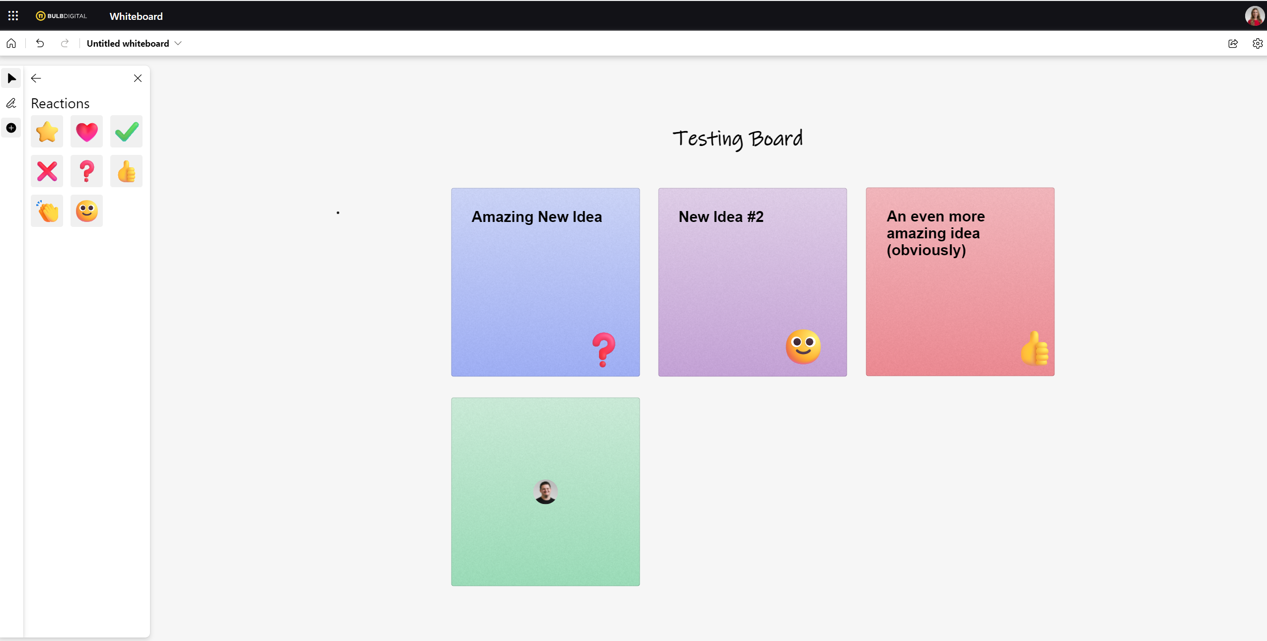
Reactions are a brand-new feature to Whiteboard. They give collaborators the ability to add a reaction to ideas on the board, live during a meeting. I especially love this when I want teams to vote on ideas. Reactions are a fantastic way to keep people engaged!
.png)
Images
Images are another new feature of Whiteboard. By selecting the images icon in the interface, I can select images from my computer to add a visual element to the canvas.
.png)
Collaboration
A huge improvement to Whiteboard is in the collaboration features. Before, I was unable to identify which team member was working on which item of the Whiteboard. Changes would simply just appear, and sometimes users' changes would conflict with each other. Microsoft has announced that collaborative cursers are coming – which means individuals’ mouse pointers are visible live and labeled with the users’ names. This isn’t available yet, however, already launched in the web version is the ability to see what collaborators are working on by placing their M365 profile photo where they are working. Below, I can see that my coworker is working on the green sticky note:

That identification makes for an easier overall experience and less asking each other who did what.
Conclusion
Tools that allow us to run effective meetings when participants are all or partially virtual are invaluable. I’ve enjoyed using the new, revamped Whiteboard and believe it is a significant improvement from the previous version. Because of the improvements, I don’t feel the need to go outside of the Microsoft stack for a solid collaboration tool. The new desktop app will have even more features and should be rolling out in February 2022 (according to the Microsoft 365 Roadmap this month).

SELF ASSESSMENT
Is your business getting full value from your M365 subscription?
Billions of dollars are wasted each year on underused subscriptions. Take 3 minutes to find out where your tools are driving results, and where they’re holding you back.
Find Out Now

Is Team Communication Holding You Back?
Find Out in Just 2 Minutes.
Take our quick scorecard to uncover communication gaps and hidden barriers within your team.


.avif)


