New Teams: Here's What to Know
A new Teams app is coming, and it's rebuilt from the ground up. It's faster, smarter, and more flexible. Let's take a look!
Intro
If you use Teams for working remotely these days like me, then by now you’re probably a pro at jumping on and off calls – so it’s frustrating if it feels like sometimes the tool can’t keep up with your keystrokes.
Before we dive into what New Teams is about, we want to make a quick disclaimer. New Teams is in preview testing right now, so approach this with a bit of curiosity and hesitation. This is all exciting news to hear about the new features that are to come in the future, but right now many of the apps in Teams, such as Planner, don't work in New Teams' beta testing phase, but we're looking forward in seeing what's to come with New Teams!
When we get good at using something daily, small things like loading of a program, switching between profiles, or a delay in refreshing content is noticeable. Microsoft has recognized this and has prioritized restructuring the Teams app to perform in a faster, simpler, and more flexible experience that even newer users will notice. Some features are still rolling out, but many of them are actually available to you right now and you really should give it a try if you don’t mind that they’re still in preview mode.
The New Microsoft Teams
At the time of writing this I’ve been using the new Team preview for about a month and I haven’t thought once about switching back. At this point it can be easy to forget what "old Teams" even feels like.

Turning on the new Teams experience is super easy. The next time you open the desktop app, check in the top left for a toggle that says `Try the New Teams` and click it. The new experience will download and reopen on your machine without even needing a restart, so you'll be able to jump right in. The rollout of new Teams is pretty fluid right now - some commercial users have the toggle already, some need their admin to enable it, and some in limited tenants like GCC won’t have it for a bit. I have a section at the end that walks you through how to update your app, since that could be a potential roadblock to getting the new version.
It’s Faster
When you get on the new experience for Teams, it does look slightly different, but the biggest thing you’ll enjoy is just how much faster the app launches and runs. They’ve practically cut the time in half for everything!
Check it out in real time here!
It’s not just how quickly the window to the app opens, but how quickly the chat and channels lists load in instead of watching the old tile cards spinning up.
You can scroll through long chat histories and immediately see file icons or images that were posted, which is awesome when you already know what you’re looking for visually.
Faster speeds are a welcome addition, since Teams can be sort of slow to begin with. Just thinking about how much I hop in and out of this app each day makes me realize how important speeding up these parts of the app benefit me when I'm late for a call or in crisis mode.
It’s Simpler
The other biggest change you’ll notice is the design and interface of Teams chat and channels is much more simple. Channels are a bit different now. They no longer work like chat from the bottom-up on the screen. Now people read and post from the top of the screen and create threads that flow naturally down as far as they need to. When I say as far as you need to, I mean it. Instead of loading ten items at a time in a channel thread, you have infinite scrolling, and it works.
This change may be a bit confusing to end users, but we're hoping in the end it allows there to be more of a distinction between the "conversation" a channel post warrants, versus a casual chat message.
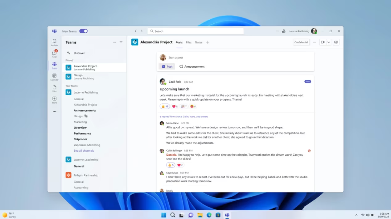
MS shifted some less-frequently used buttons and reduced a lot of toolbar noise to put things in a more prioritized space. I love this change, since it's important to be focused on the messages and content, and not have it feel like a Word document command center.
Meanwhile, when we’re presenting live content from other apps in meetings or calls, we still want a good level of control. That’s why I love the new setup they’ve added for stage and presenter views. I’m a big advocate for sharing your browser (instead of full screen) and the fact that you can now display a presentation or file while monitoring your audience at the same time makes me feel confident and secure.
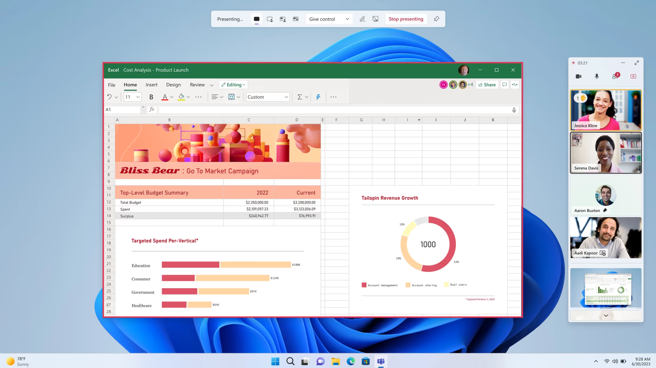
Overall, the styling of the new Team components, colors, and animation feel familiar but also fresh. It’s cool to see more companies leaning into cultural enhancements like dynamic emojis and emotional background states, since the environment we work in should be both productive and fun.
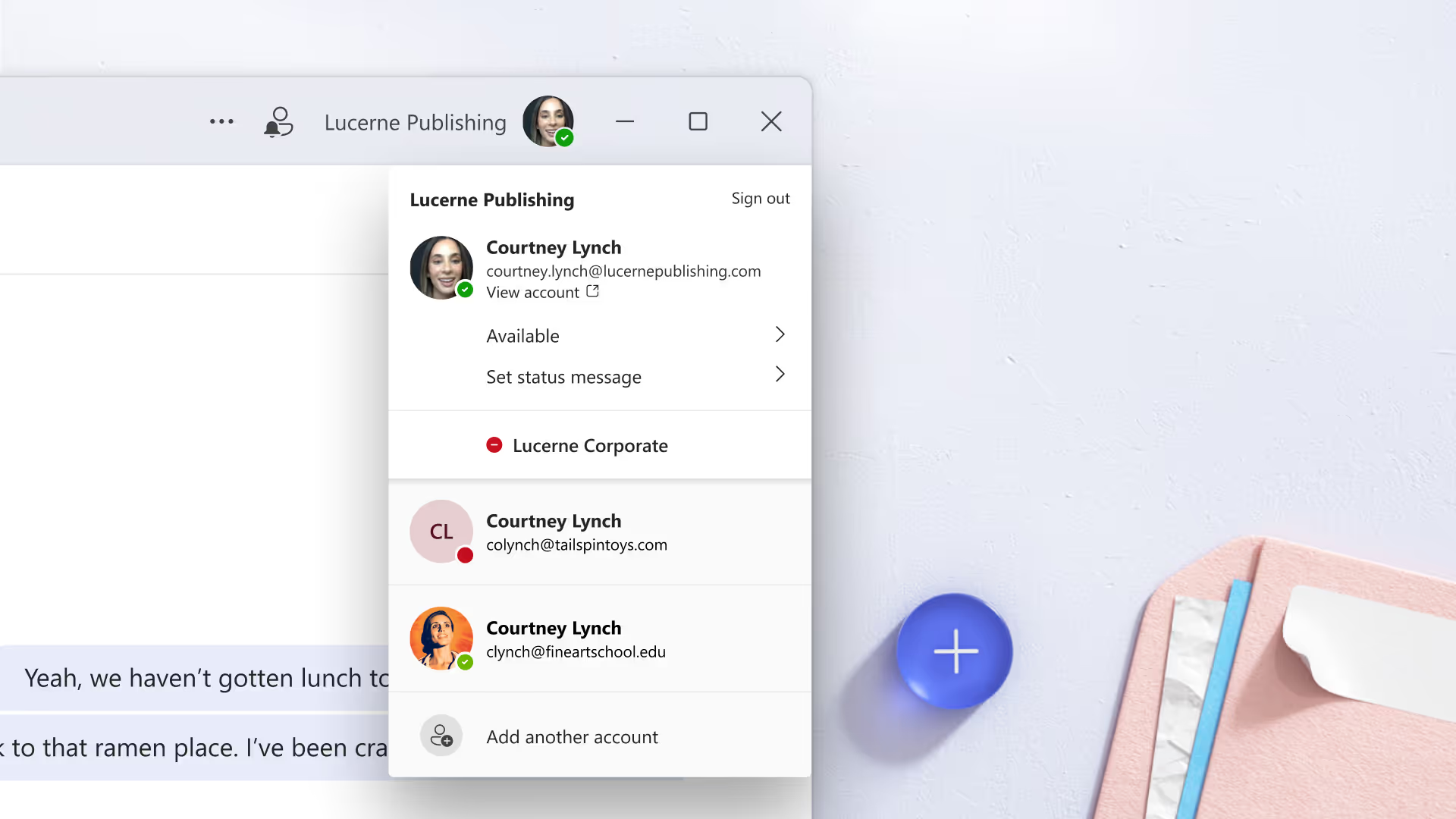
Letting users take customizations to the next level for their own unique working style is huge too. I was already color-theming my chrome browsers to discern between clients, but now I can do it right within Team groups, so I don’t get lost working between tenants.
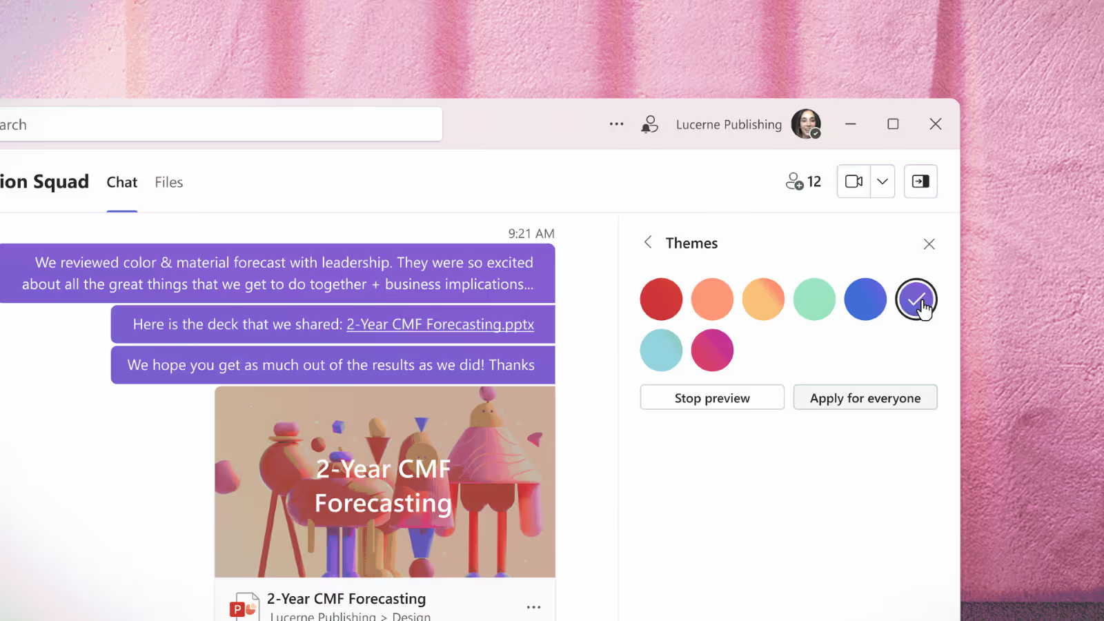
I do want to mention that this simplified Teams design will be hitting the current Teams experience too. So eventually you’ll get these benefits even if you don’t switch to the new experience, but you can try some of it out now in preview mode to get the feel of it.
SELF ASSESSMENT
Is your business getting full value from your M365 subscription?
Billions of dollars are wasted each year on underused subscriptions. Take 3 minutes to find out where your tools are driving results, and where they’re holding you back.
Find Out Now

Is Team Communication Holding You Back?
Find Out in Just 2 Minutes.
Take our quick scorecard to uncover communication gaps and hidden barriers within your team.
It's Flexible
As a consultant in the M365 space, it's been challenging to swap between profiles for different clients. Instead, I opted to create different browser profiles and used the online (old) Teams experience to limit authentication and loading issues.
But with New Teams, they've improved login, syncing, and notifications when you’re working simultaneously across tenants. This is a huge change for someone like me. It’s a given that I’ll probably be moving back into the desktop application since more of the features reside in that experience.
How to Enable New Teams
If you can see the toggle in the top left corner, you can try it today! Just flip the switch and go.
If you don't have that toggle, try clicking the ellipses by your profile and click `Check for updates`, then give it some time to download before reopening the app.
If that trick still doesn’t show the toggle for you, the next step is to get your IT administrator involved. Talk to them about what it would look like to enable the new Teams experience at your organization. I'm sure they'd appreciate you sending them the instructions to enable it as well.
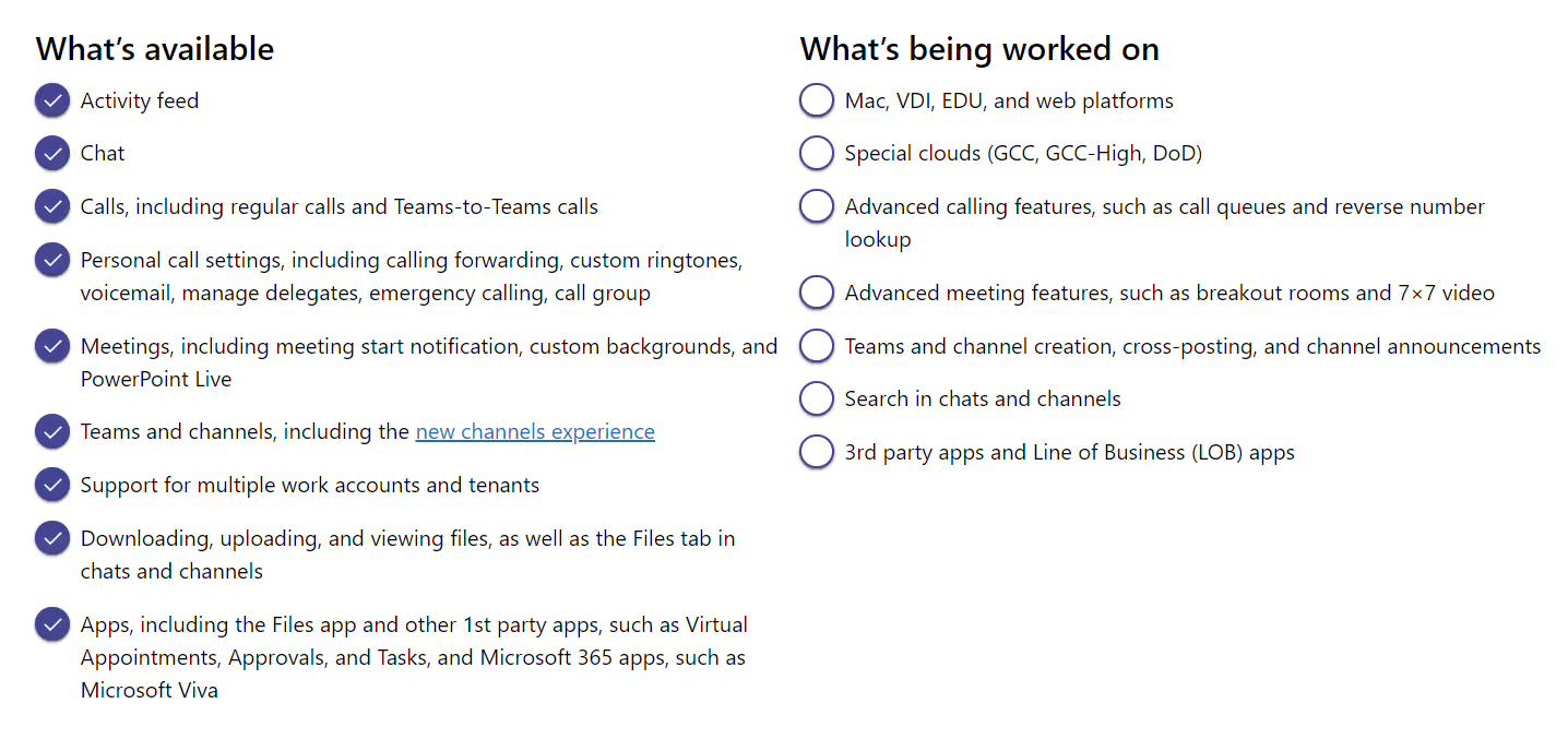
All this stuff is cool and exciting, but the reality is that the modern workplace changes frequently, and it’s your administrator's job to ensure that new features won’t break or get in the way of existing tools at your organization. They need to look at feature limitations and understand the rollout schedule before committing your group as early adopters, since some of these components are still in a buggy working state.
Conclusion
So far exploring the new Teams experience has been really intuitive and enjoyable, and I think you’ll find it that way too, regardless of how much you’ve used it in the past. Since you can still switch back to classic Teams at any time, there really isn’t any risk in trying it out and you gain insight into the new features before it’s fully launched.
Just remember everything is considered beta and can be buggy in preview mode. So, if you don’t mind the occasional hiccup, then it’s time to flip that toggle, get on the fast track, and take your Teams experience to the next level.






.jpg)


