How To Use the Gallery View in Microsoft Lists
List views have never been great at displaying visual content. Introducing: The Gallery View in the Lists App and SharePoint.
Microsoft teased the gallery view when announcing the Lists app, but it wasn’t included at launch. They’ve just recently pushed an update that enables gallery view, so we wanted to take a look and put together some detail around how to use it.
Why Is This Useful?
Sometimes different content calls for different kinds of display. The standard list view is really helpful when you want to see a lot of columns and scan the content. It follows our natural reading “F-shape” pattern. But, it doesn’t do well with visual content. You’re limited to a small avatar unless you display bigger thumbnails that break up the scan-ability.
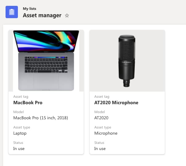
The Gallery View on the other hand is very well suited for visual content, or when you want to focus more on individual items and less on the whole list. If seeing images in that list context is helpful (maybe you want to see images of assets in an asset management list), try out the Gallery View. The Gallery View generally looks nicer, but it also creates longer pages and forces you to do more scrolling.
So what I’m trying to say is that this fancy new feature, while visually appealing, is not a one-size-fits-all solution. It works well in the right context.
Changing the View
If you aren’t familiar with changing the view in a list, there is a dropdown in the top right that will say something like “All Items” by default. Click that, and you’ll see a couple of options:
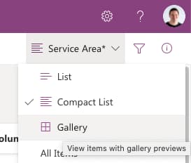
- List (Default List View)
- Compact List (Tightens up the items to see more on one page)
- Gallery (The New View)
Select Gallery and let’s give it a look.

SELF ASSESSMENT
Is your business getting full value from your M365 subscription?
Billions of dollars are wasted each year on underused subscriptions. Take 3 minutes to find out where your tools are driving results, and where they’re holding you back.
Find Out Now

Is Team Communication Holding You Back?
Find Out in Just 2 Minutes.
Take our quick scorecard to uncover communication gaps and hidden barriers within your team.
Card Designer
Lists will pick some fields to display by default in the card, but also gives you the ability to customize that view. To do that, they provide a Card Designer.
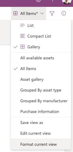
To access the card designer, click that view dropdown again while in Gallery mode, and click “Format Current View”. Select Card Designer, and click Edit Card.
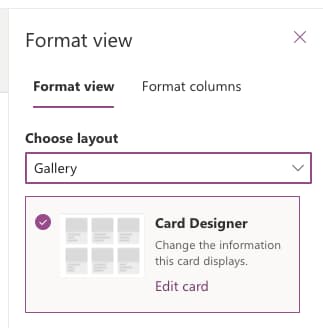
This opens up a side panel that shows all the fields available on the list with checkboxes to select if they should be displayed or not. You can drag and drop these fields to change the order they’re displayed in as well.

Note that some of the fields like image and people fields have extra settings associated with them. You can toggle to show a preview of the image/person there.

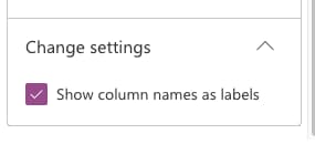
At the bottom of the panel, you’ll notice a “Change Settings” section that has a “Show column names as labels” checkbox in it. This allows you to toggle whether or not the actual field names are displayed on the card. If your information is pretty easy to infer what field is being displayed, it might make sense to hide the field names to save on a little real estate.
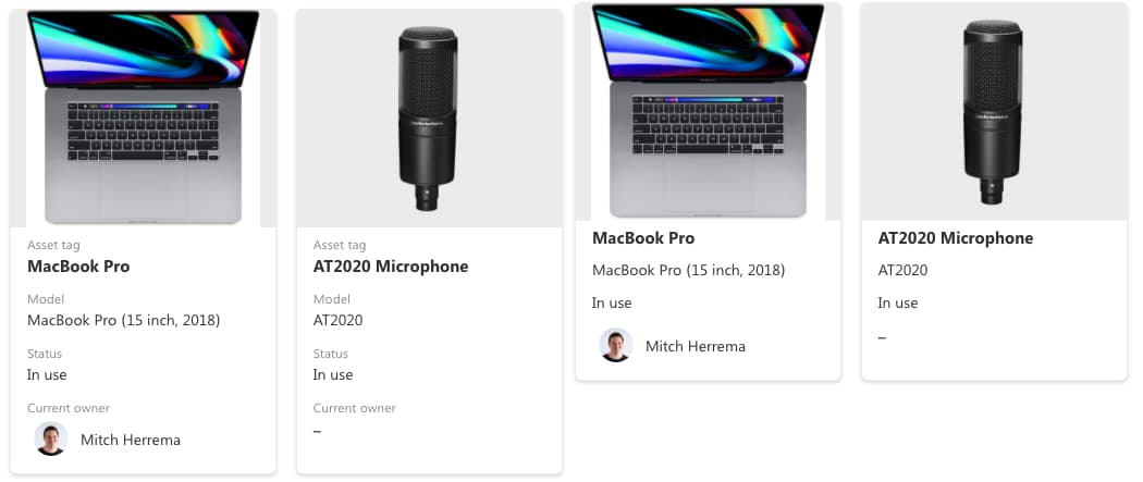
You can also save multiple different card views the same way you would with a list view by clicking “Save view as”, and adjusting that view’s card designer.
Available In SharePoint
The last thing to note is this view isn’t only limited to lists within the Lists App. The same functionality now exists in SharePoint as well. You can navigate to any of your lists that you use, and you should notice the Gallery option displayed there as well.
Something interesting I noticed is that typically only lists that were created in the Lists app display in the list of recently accessed lists on the Lists home page. But when you toggle the gallery view for a SharePoint List, that list will display in the recent lists as well.
Conclusion
We’re looking forward to seeing how we’re able to integrate this Gallery View into our work, and we hope you are as well. In short, stick with the standard list view if you have lots of data and want to scan, but try the Gallery View if you have some visual content and scanning is a secondary priority.
Lists will surely have more updates in the future, so be sure to follow along as we share those updates!


.jpg)


